3 Visualization tools
Clouds are the prime matter of these study. They are condensed, information-rich representations of patterns found in a corpus and should, according to the Distributional Hypothesis, tell us something about the meaning of the words under examination. But they don’t tell us anything by themselves: we need to develop and implement tools to extract this information. Chief among these tools is a web-based visualization tool (Montes & QLVL 2021), originally developed by Thomas Wielfaert within the Nephological Semantics project (see Wielfaert et al. 2019), and then continued by myself17. In this chapter we will present its rationale and the features it offers, as an elaboration of Montes & Heylen (2022).
Section 3.1 will offer an overview of the rationale behind the tool and the minimal path that a researcher could take through its levels. Sections 3.2 through 3.4 will zoom in on each of the levels, describing the current features and those that are still waiting on our wish list. Section 3.5 follows with the description of a ShinyApp (Chang et al. 2021): an extension18 to the third level of the visualization with additional features tailored to exploring the relationship between the 2d representations and the hdbscan output. Finally, we conclude with a summary in Section 3.6.
3.1 Flying through the clouds
The visualization tool described here, which I will call NephoVis, was written in Javascript, making heavy use of the d3.js library, which was designed for beautiful web-based data-driven visualization (Bostock, Ogievetsky & Heer 2011). The d3 library allows the designer to link elements on the page, such as circles in an svg, dropdown buttons and titles, to data structures such as arrays and data frames, and manipulate the visual elements based on the values of the linked data items. In addition, it offers handy functions for scaling and mapping, i.e. to fit the relatively arbitrary ranges of the coordinates to pixels on a screen, or to map a colour palette19 to a set of categorical values.
As we have seen in Chapter 2, the final output of the modelling procedure is a 2d representation of distances between tokens, which can be visualized as a scatterplot. Crucially, we are not only interested in exploring individual models, but in comparing a range of models generated by variable parameters. Section 2.2.2 discussed a procedure to measure the distance between models, which can be provided as input for non-metric mds, and Section 2.4 presented the technique used to select representative models, or medoids. As a result, we have access to the following datasets for each of the lemmas:
- A distance matrix between models.
- A data frame with one row per model, the nmds coordinates based on the distance matrix, and columns coding the different variable parameters or other pieces of useful information, such as the number of modelled tokens.
- A data frame with one row per token, 2d coordinates for each of their models and other information such as sense annotation (see Chapter 4), country, type of newspaper, selection of context words and concordance line.
- A data frame with one row per first-order context word and useful frequency information.
In practice, the data frame for the tokens is split in multiple data frames with coordinates corresponding to different dimensionality reduction algorithms, such as nmds and t-sne with different perplexity values, and another data frame for the rest of the information. In addition, one of the most recent features of the visualization tool includes the possibility to compare an individual token-level model with the representation of the type-level modelling of its first-order context words. However, this feature is still under development within NephoVis and can be better explored in the ShinyApp extension (Section 3.5).
In order to facilitate the exploration of all this information, NephoVis is organized in three levels, following Shneiderman’s Visual Information Seeking Mantra: “Overview first, zoom and filter, then details-on-demand” (1996: 97). The core of the tool is the interactive, zoomable scatterplot, but its goal and functionality is adapted to each of the three levels. In Level 1 the scatterplot represents the full set of models and allows the user to explore the quantitative effect of different parameter settings and to select a small number of models for detailed exploration in Level 2. This second level shows multiple token-level scatterplots — one for each of the selected models —, and therefore offers the possibility to compare the shape and organization of the groups of tokens across different models. By selecting one of these models, the user can examine it in Level 3, which focuses on only one at a time. Shneiderman (1996)’s mantra underlies both the flow across levels and the features within them: each level is a zoomed in, filtered version of the level before it; the individual plots in Levels 1 and 3 are literally zoomable; and in all cases it is possible to select items for more detailed inspection. Finally, a number of features — tooltips and pop-up tables — show details on demand, such as the names of the models in Level 1 and the context of the tokens in the other two levels.
Figure 3.1: Portal of https://qlvl.github.io/NephoVis/ as of July 2021.
Currently, https://qlvl.github.io/NephoVis/ hosts the portal shown in Figure 3.1, which eventually leads the user to the Level 1 page for the lemma of their choice20, shown in Figure 3.2 and described in more detail in Section 3.2. By exploring the scatterplot of models, the user can look for structure in the distribution of the parameters on the plot.
For example, colour coding may reveal that models with nouns, adjectives, verbs and adverbs as first-order context words (lex) are very different from those without strong filters for part-of-speech, because mapping these values to colours reveals distinct groups in the plot. In contrast, mapping the sentence boundaries restriction (bound/nobound) might result in a mix of dots of different colours, like a fallen bag of m&m’s, meaning that the parameter makes little difference. Depending on whether the user wants to compare models similar or different to each other, or which parameters they would like to keep fixed, they will use individual selection or the buttons to choose models for Level 2. The
Select medoids
button21 quickly identifies the predefined medoids. By clicking on the
LEVEL 2 button,
Level 2 is opened in a new tab, as shown in Figure 3.3.
In Level 2, the user can already compare the shapes that the models take in their respective plots, the distribution of categories like sense labels, and the number of lost tokens. If multiple dimensionality reduction techniques have been used, the Switch solution button allows the user to select one and watch the models readjust to the new coordinates in a short animation. In addition, the Distance matrix button offers a heatmap of the pairwise distances between the selected models. Section 3.3 will explore the most relevant features that aid the comparison across models, such as brushing sections of a model to find the same tokens in different models and accessing a table with frequency information of the context words co-occurring with the selected tokens. Either by clicking on the name of a model or through the Go to model dropdown menu, the user can access Level 3 and explore the scatterplot of an individual model. As Section 3.4 will show, Level 2 and Level 3, both built around token-level scatterplots, share a large number of functionalities. The difference lies in the possibility of examining features particular of a model, such as reading annotated concordance lines highlighting the information captured by the model or selecting tokens based on the words that co-occur with it. In practice, the user would switch back and forth between Level 2 and Level 3: between comparing a number of models and digging into particular models.
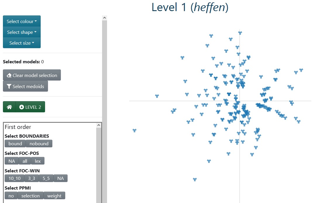
Figure 3.2: Level 1 for heffen ‘to levy/to lift’.
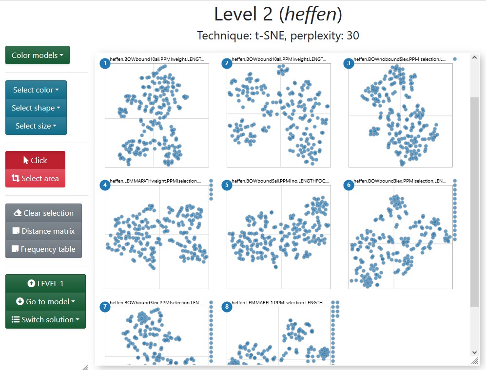
Figure 3.3: Level 2 for the medoids of heffen ‘to levy/to lift.’
Before going into the detailed description of each level, a note is in order. As already mentioned in Section 2.2.3, the dimensions resulting from nmds — used in all levels — and t-sne — used in levels 2 and 3 — are not meaningful. In consequence, there are no axes or axis ticks in the plots. However, the units are kept constant within each plot: one unit on the \(x\)-axis has the same length in pixels as one unit on a \(y\)-axis within the same scatterplot; this equality, however, is not valid across plots. Finally, the code is open-source and available at https://github.com/qlvl/NephoVis.
3.2 Level 1
The protagonist of Level 1 is an interactive zoomable scatterplot where each glyph, by default a steel blue wye (“Y”), represents one model. This scatterplot aims to represent the similarity between models as coded by the nmds output and allows the user to select the models to inspect according to different criteria. Categorical variables (e.g. whether sentence boundaries are used) can be mapped to colours and shapes, as shown in Figure 3.4, and numerical variables (e.g. number of tokens in the model) can be mapped to size.
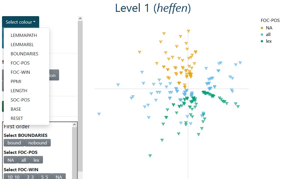
Figure 3.4: Level 1 for heffen ‘to levy/to lift’; the plot is colour-coded with first-order part-of-speech settings; NA stands for the dependency-based models.
A selection of buttons on the left panel, as well as the legends for colour and shape, can be used to filter models with a certain parameter setting. These options are generated automatically by reading the columns in the data frame of models and interpreting column names starting with foc_ as representing first-order parameter settings, and those starting with soc_ as second-order parameter settings. Different settings of the same parameter interact with an OR relationship, since they are mutually exclusive, while settings of different parameters combine in an AND relationship. For example, by clicking on the grey bound and lex buttons on the bottom left, only BOW models with part-of-speech filter and sentence boundary limits22 will be selected. By clicking on both lex and all, all BOW models are selected, regardless of the part-of-speech filter, but dependency-based models (for which part-of-speech is not relevant) are excluded. A counter above, circled in Figure 3.5, keeps track of the number of selected items, since Level 2 only allows up to 9 models for comparison23. This procedure is meant to aid a selection based on relevant parameters, as described in Section 2.4. In Figure 3.5, instead, the Select medoids button was used to quickly capture the medoids obtained from pam.
Models can also be manually selected by clicking on the glyphs that represent them.
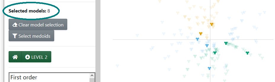
Figure 3.5: Level 1 for heffen ‘to levy/to lift’ with medoids highlighted.
3.3 Level 2
Level 2 shows an array of small scatterplots, each of which represents a token-level model. The glyphs, by default steel blue circles, stand for individual tokens, i.e. attestations of the chosen lemma in a given sample. The original code for this level was inspired by Mike Bostock’s brushable scatterplot matrix, but it is not a scatterplot matrix itself, and its current implementation is somewhat different.
The dropdown menus on the sidebar (Figure 3.3) read the columns in the data frame of variables, which can include any sort of information for each of the tokens, such as sense annotation, sources, number of context words in a model, concordance lines, etc. Categorical variables can be used for colour- and shape-coding, as shown in Figure 3.8, where the senses of the chosen lemma are mapped to colours; numerical variables, such as the number of context words selected by a given lemma, can be mapped to size. Note that the mapping will be applied equally to all the selected models: the current code does not allow for variables — other than the coordinates themselves — to adapt to the specific model in each scatterplot. That is the purview of Level 3.
Before further examining the scatterplots, a small note should be made about the distance matrix mentioned above. The heatmap corresponding to the medoids of heffen ‘to levy/to lift’ is shown in Figure 3.6.
The nmds representation in Level 1 tried to find patterns and keep the relative distances between the models as faithful to their original positions as possible, but such a transformation always loses information. Given a restricted selection of models, however, the actual distances can be examined and compared more easily. A heatmap maps the range of values to the intensity of the colours, making patterns of similar/different objects easier to identify. For example, Figure 3.6 shows that the sixth medoid is very different from all the other medoids except from the seventh, and that the second medoids is quite different from all the others except the first. Especially when the model selection followed a criterion based on strong parameter settings, e.g. keeping PPMI constant to look at the interaction between window size and part-of-speech filters, such a heatmap could reveal patterns that are slightly distorted by the dimensionality reduction in Level 1 and even hard to pinpoint from visually comparing the scatterplots. But even with the medoid selection, which aims to find representatives that are maximally different from each other (or at least that are the core elements of maximally different groups), the heatmap can show whether some medoids are drastically more different, or conversely, similar to others.
As a reference, the heatmap is particularly useful to check hypotheses about the visual similarity of models. For example, unlike with heffen ‘to levy/to lift’ in Figure 3.8, if we colour-code the medoids of haten ‘to hate’ with the manual annotation (Figure 3.7), all the models look equally messy. As we will see below, we can brush over sections of the plot to see if, at least, the tokens that are close together in one medoid are also close together in another (spoiler alert: not the case). The heatmap of distances confirms that not all models are equally different from each other, but indeed, each of them are messy in their own particular way.
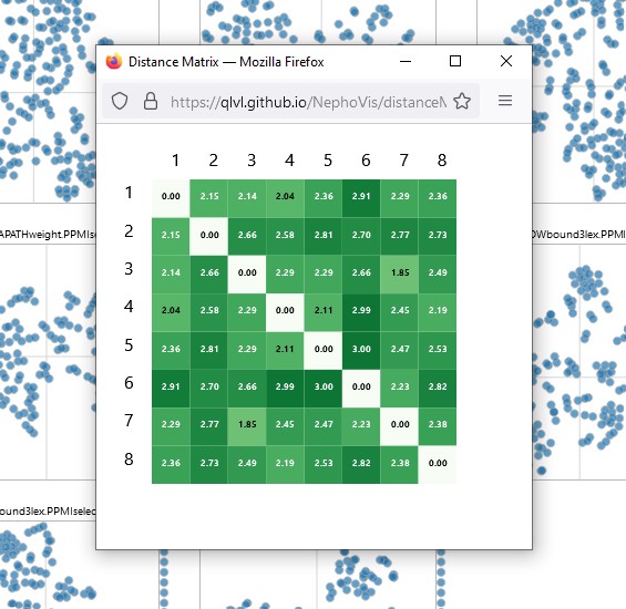
Figure 3.6: Heatmap of distances between medoids of heffen ‘to levy/to lift.’
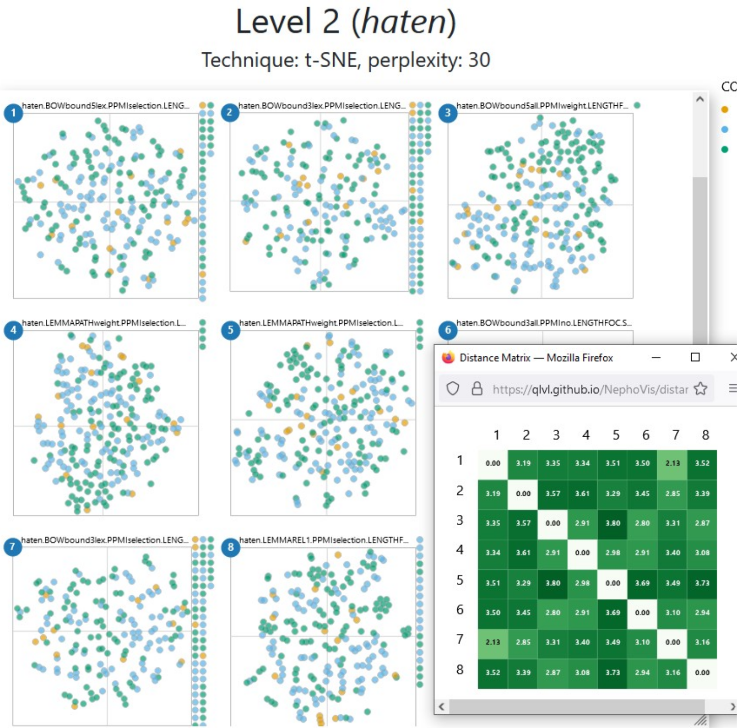
Figure 3.7: 2D representation of medoids of haten ‘to hate,’ colour-coded with senses, next to the heatmap of distances between models.
Next to the colour-coding, Figure 3.8 also illustrates how hovering over a token shows the corresponding identifier24 and concordance line. Figure 3.9, on the other hand, showcases the brush-and-link functionality. By brushing over a specific model, the tokens found in that area are highlighted and the rest are made more transparent. Such a functionality is missing from Level 1, but is also available in Level 3. Level 2 enhances the power of this feature by selecting the same tokens in the rest of the models, whatever area they occupy. Thus, we can see whether tokens that are close together in one model are still close together in a different model, which is specially handy in more uniform plots, like the one for haten ‘to hate’ in Figure 3.7. Figure 3.9 reveals that the tokens selected in the second medoid are, indeed, quite well grouped in the other five medoids around it, with different degrees of compactness. It also highlights two glyphs on the right margin of the bottom right plot. In Level 2, this margin gathers all the tokens that were selected for modelling but were lost by the model in question due to lack of context words. In this case medoid 6, with a combination of bound3lex and PPMIselection, is extremely selective, and for a few tokens no context words could be captured.
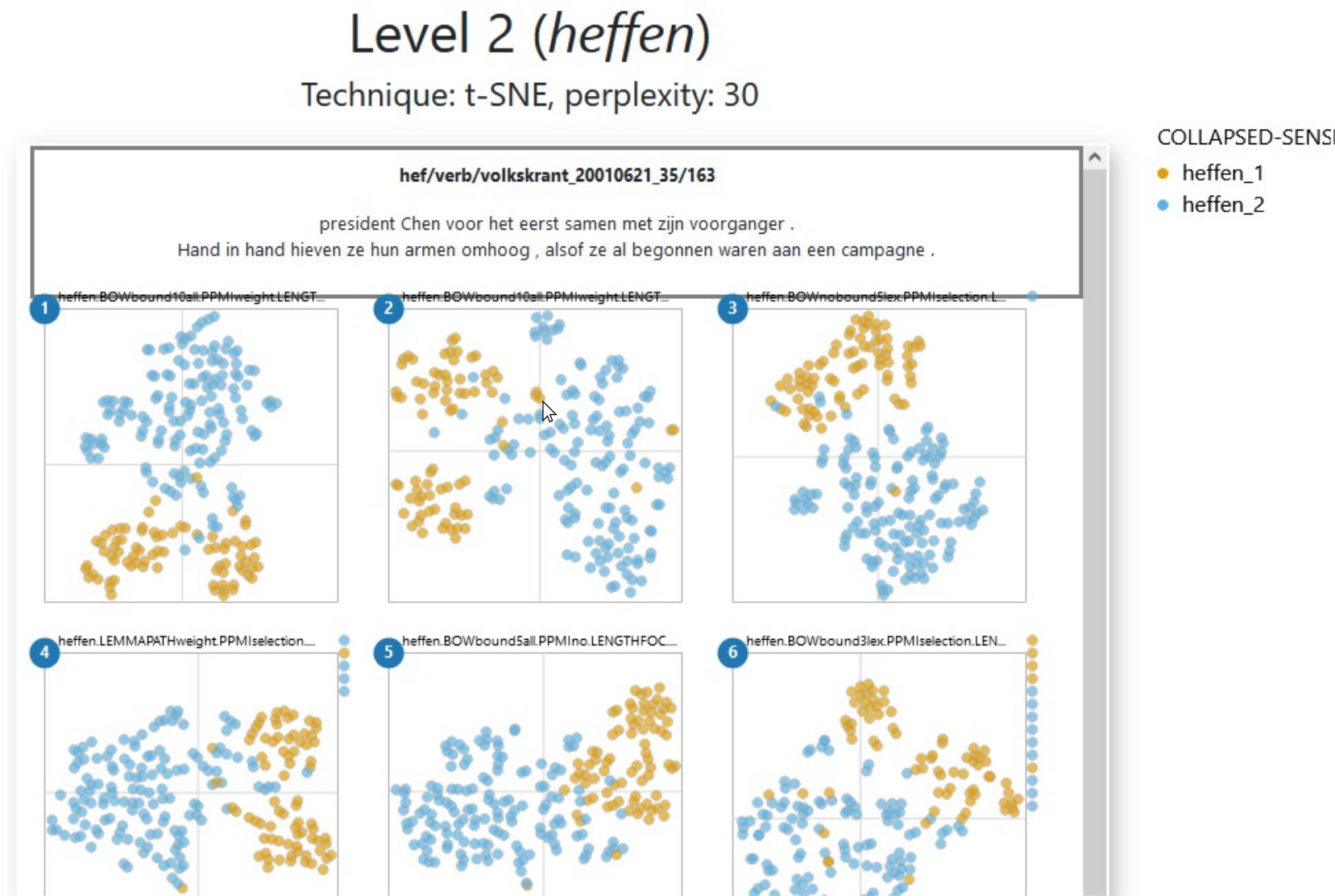
Figure 3.8: Level 2 for the medoids of heffen ‘to levy/to lift,’ colour-coded with categories from manual annotation. Hovering over a token shows its concordance line.
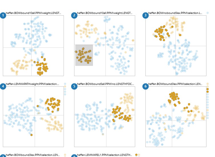
Figure 3.9: Level 2 for the medoids of heffen, colour coded with categories from manual annotation. Brushing over an area in a plot selects the tokens in that area and their positions in other models.
In any given model, we expect tokens to be close together because they share a context word, and/or because their context words are distributionally similar to each other: their type-level vectors are near neighbours. Therefore, when inspecting a model, we might want to know which context word(s) pull certain tokens together, or why tokens that we expect to be together are far apart instead. For individual models, this can be best achieved via the ShinyApp described in Section 3.5, but NephoVis also includes features to explore the effect of context words, such as frequency tables.
In Level 2, while comparing different models, the frequency table has one row per context word and one or two columns per selected model, e.g. the medoids. Such a table is shown in Figure 3.10.
The columns in this table are all computed by NephoVis itself based on lists of context words per token per model. Next to the column with the name of the context word, the default table shows two columns called “total” and two per model, headed by the corresponding number and either a “+” or a “-” sign. The “+” columns indicate how many of the selected tokens in that model co-occur with the word in the row; the “-” columns indicate the number of non selected tokens that co-occur with the word. The “total” columns indicate, respectively, the number of selected or non-selected tokens for which that context word was captured by at least one model.
Here it is crucial to understand that, when it comes to distributional modelling, a context word is not simply a word that can be found in the concordance line of the token, but an item captured by a given model. Therefore, a word can be a context word in a model, but be excluded by a different model with stricter filters. For example, the screenshot25 in Figure 3.10 gives us a glimpse of the frequency table corresponding to the tokens selected already in Figure 3.9. The most frequent context word for the 31 selected tokens, i.e. the first row of the table, is the noun glas ‘glass,’ which is used in expressions such as een glas heffen op iemand ‘to toast for someone, lit. to lift a glass on someone.’ The columns for models 1 an 2 show that glas ‘glass’ was captured by those models for all 31 selected tokens. In column 3, however, the positive column reads 29, which indicates that the model missed the co-occurrence of glas ‘glass’ in two of the tokens. The names on top of the plots reveal that the first two models have a window size of 10, while the third restricts it to 5, meaning that in the two missed tokens glas ‘glass’ occurs 6 to 10 slots away from the target. These are most likely the orange tokens a bit far to the right of the main highlighted area in the third plot. Finally, in the fourth model, which is hidden behind the table, glas ‘glass’ is missed from one of the 31 tokens but captured in 2 tokens that were excluded from the selection. If we moved the window of the table we would see that this is a PATHweight model: the missed co-occurrence must be within the bow window span but too far in the dependency path, wile the two captured co-occurrences in the “-” column must be within three steps of the dependency path but beyond the bow window span of 10. This useful frequency information is available for all the context words that are captured by at least one model in any of the selected tokens. In addition, the Select information dropdown menu gives access to a range of transformations based on these frequencies, such as odds ratio, Fisher Exact and cue validity.
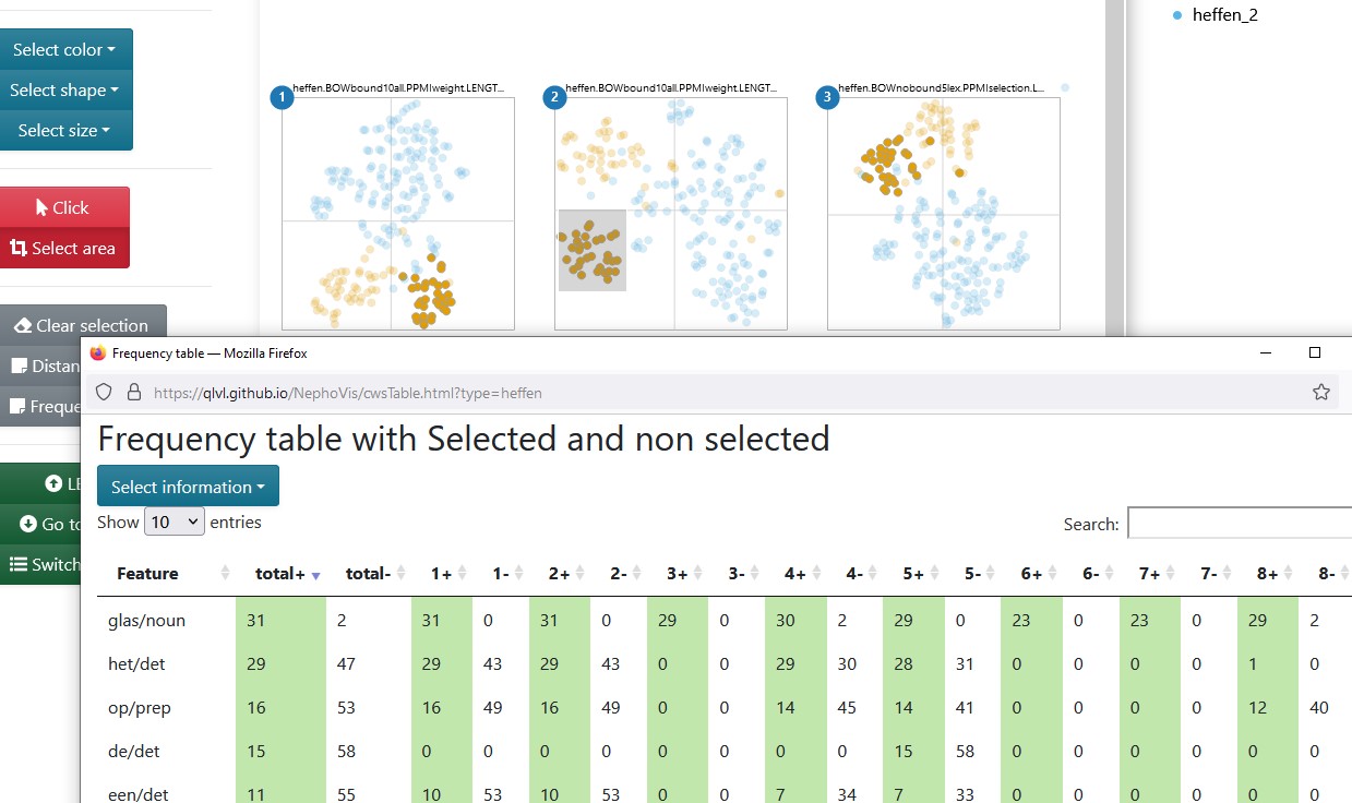
Figure 3.10: Level 2 for the medoids of heffen ‘to levy/to lift,’ and frequency table of the the context words co-occurring with the selected tokens across models.
The layout of Level 2, showing multiple plots at the same time and linking the tokens across models, is a fruitful source of information, but it has its limits. To exploit more model-specific information, we go to Level 3.
3.4 Level 3
Level 3 of the visualization tool shows a zoomable, interactive scatterplot in which each glyph, by default a steel blue circle, represents a token, i.e. an attestation of the target lexical item. An optional second plot has been added to the right, in which each glyph, by default a steel blue star, represents a first-order context word, and the coordinates derive from applying the same dimensionality reduction technique on the type-level cosine distances between the context words. The name of the model, coding the parameter settings, is indicated on the top, followed by information on the dimensionality reduction technique. Like in the other two levels, it is possible to map colours and shapes to categorical variables, e.g. sense labels, and sizes to numerical variables, e.g. number of available context words, and the legends are clickable, allowing the user to quickly select the items with a given value.
Figure 3.11 shows what Level 3 looks like if we access it by clicking on the name of the second model in Figure 3.9. Colour-coding and selection are transferred between the levels, so we can keep working on the same information if we wish to do so. Conversely, we could change the mappings and selections on Level 3, based on model-specific information, and then return to Level 2 (and refresh the page) to compare the result across models. For example, if the frequency table in Figure 3.10 had shown us that glas ‘glass’ was also captured in tokens outside our selection, or if we had reason to believe that not all of the selected tokens co-occurred with glas ‘glass’ in this model, we could input glas/noun on the Features in model field in order to select all the tokens for which glas ‘glass’ was captured in the model, and only those. Or maybe we would like to find the tokens in which glasje ‘small glass’ occurs, but we are not sure how they are lemmatized, so we can input glasje in the Context words field to find the tokens that include this word form in the concordance line, regardless of whether its lemma was captured by the model26.
In sum, (groups of) tokens can be selected in different ways, either by searching words, inputting the id of the token, clicking on the glyphs or brushing over the plots.27 Given such a selection, clicking on Open frequency table will call a pop-up table with one row per context word, a column indicating in how many of the selected tokens it occurs, and more columns with pre-computed information such as pmi (see Figure 3.12). These values can be interesting if we would like to strengthen or weaken filters for a smarter selection of context words.
Like Level 2, Level 3 also offers the concordance line of a token when hovering over it. But unlike Level 2, the concordance can be tailored to the specific model on focus, as shown in Figure 3.11. The visualization tool itself does not generate a tailored concordance line for each model, but finds a column on the data frame that starts with _ctxt and matches the beginning of the name of the model to identify the relevant format. A similar system is used to find the appropriate list of context words captured by the model for each token. For these models, the selected context words are shown in boldface and, for PPMIweight models such as the one shown in Figure 3.11, their ppmi values with the target, e.g. heffen, are shown in superscript.
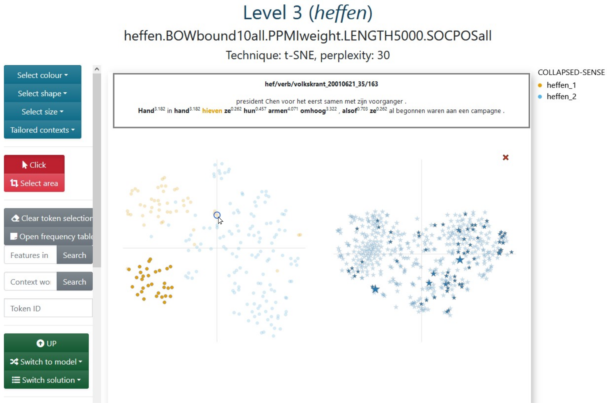
Figure 3.11: Level 3 for the second medoid of heffen ‘to levy/to lift’: bound10all-ppmiweight-5000all with some selected tokens. Hovering over a token shows tailored concordance line.
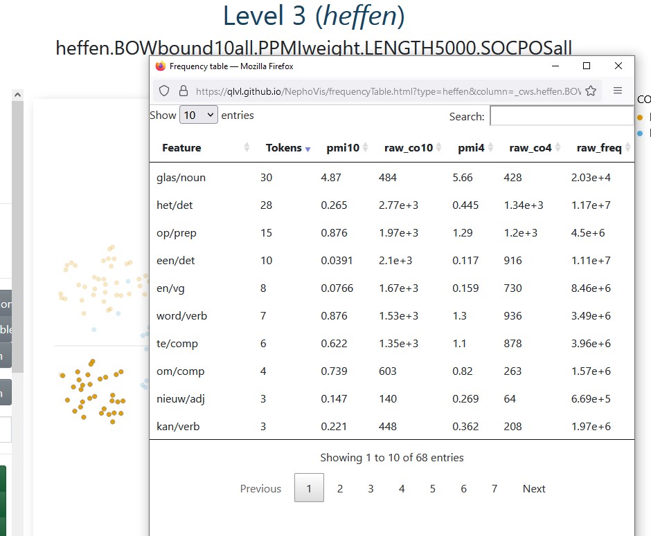
Figure 3.12: Level 3 for the second medoid of heffen ‘to levy/to lift’: bound10all-ppmiweight-5000all. The frequency table gives additional information on the context words co-occurring with the selected tokens.
As we have seen along this chapter, the modelling pipeline returns a wealth of information that requires a complex visualization tool to make sense of it and exploit it efficiently. The Javascript tool described up to now, NephoVis, was developed and used by the same people within the Nephological Semantics projects, but is meant to be deployed to a much broader audience that could benefit from its multiple features. It can still grow, and its open-source code makes it possible for anyone to adapt it and develop it further. Nevertheless, for practicality reasons, an extension was developed in a different language: R. The dashboard described in the next section elaborates on some ideas originally thought for NephoVis and particularly tailored to explore the relationship between the t-sne solutions and the hdbscan clusters on individual medoids.
3.5 ShinyApp
The visualization tool discussed in this section was written in R with the shiny library (Chang et al. 2021), which provides R functions that return html, css and Javascript for interactive web-based interfaces. The interactive plots have been rendered with plotly (Sievert et al. 2021). Unlike NephoVis, this tool requires an R server to run, so it is hosted on shinyapps.io instead of a static Github Page28. It takes the form of a dashboard, shown in Figure 3.13, with a few tabs, multiple boxes and dropdown menus to explore different lemmas and their medoids. All the functionalities are described in the About page of the dashboard, so here only the most relevant features will be described and illustrated.
The sidebar of the dashboard offers a range of controls. Next to the choice between viewing the dashboard and reading the documentation, two dropdown menus offer the available lemmas and their medoids, by number. By selecting one, the full dashboard adapts to return the appropriate information, including the name of the model on the orange header on top. The bottom half of the sidebar gives us control over the definition of relevant context words in terms of minimum frequency, recall and precision, which will be explained below.
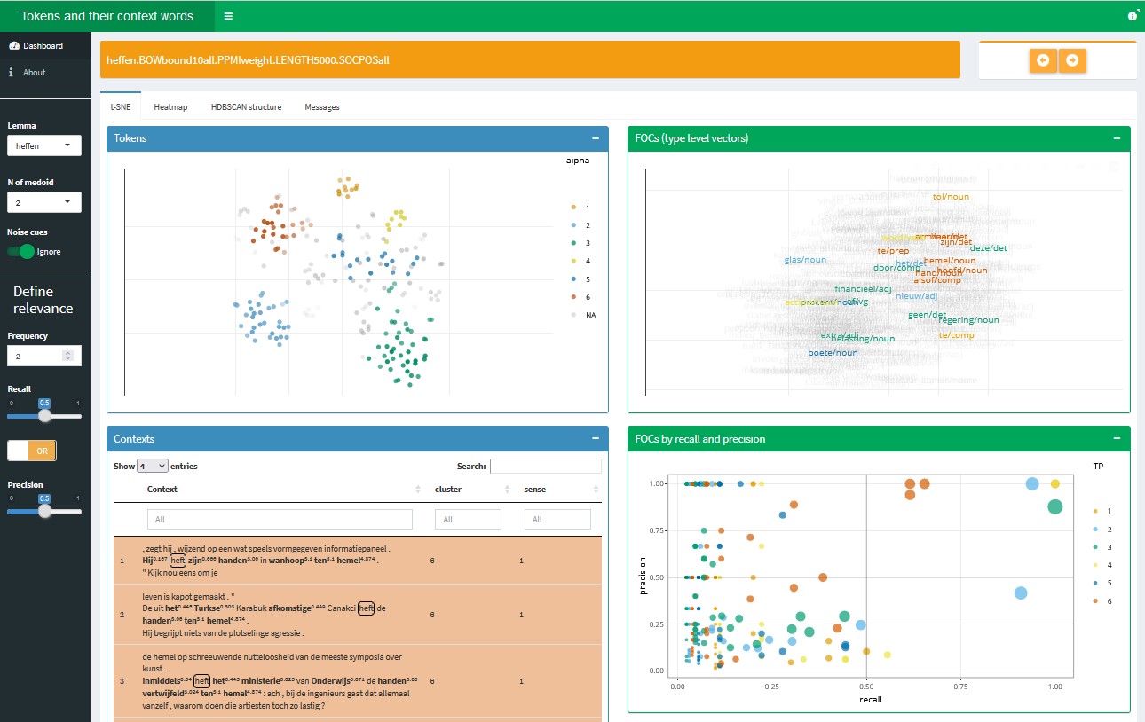
Figure 3.13: Starting view of the ShinyApp dashboard, extension of Level 3.
The main tab, t-SNE, contains four collapsable boxes: the blue ones focus on tokens while the green ones, on first-order context words. The top boxes (Figure 3.14) show t-sne representations (perplexity 30) of tokens and their context words respectively, like we would find on Level 3 of NephoVis. However, the differences with NephoVis are crucial.
First, the colours match pre-computed hdbscan clusters (\(minPts = 8\)) and cannot be changed; in addition, the transparency of the tokens reflects their \(\varepsilon\). The goal of this dashboard is, after all, to combine the 2d visualization and the hdbscan clustering for a better understanding of the models. This functionality is not currently available in NephoVis because, unlike sense tags, it is a model-dependent categorical variable29.
Second, the type-level plot does not use stars but the lemmas of the context words themselves. More importantly, they are matched to the hdbscan clusters based on the measures of frequency, precision and recall. In short, only context words that can be deemed relevant for the definition or characterization of a cluster are clearly visible and assigned the colour of the cluster they represent best; the rest of the context words are faded in the background. A radio button on the sidebar offers the option to highlight context words that are “relevant” for the noise tokens as well.
Third, the tooltips offer different information from NephoVis: the list of captured context words in the case of tokens, and the relevance measures as well as the nearest neighbours of the context word in the type-level plot. For example, in the left side of Figure 3.14 we see the same token-level model shown in Figure 3.11. Hovering over one of the tokens in the bottom left light blue cluster, we can see the list of context words that the model caputes for it: the same we could have seen in bold in the NephoVis rendering by hovering over the same token. Among them, glas/noun ‘glass’ is highlighted, because it is the only one that surpasses the relevance thresholds we have set. On the right side of the figure, i.e. the type-level plot we can see the similarities between the context words that surpass these thresholds for any cluster, and hovering on one of them provides us with additional information. In the case of glas/noun ‘glass,’ the first line reports that it represents 31 tokens in the light blue hdbscan clusters, with a recall of 0.94, i.e. it co-occurs with 94% of the tokens in the cluster, and a precision of 1, i.e. it only co-occurs with tokens in that cluster. Below we see a list of the nearest neighbours, that is, the context words most similar to it at type-level and their cosine similarity. The fact that the similarity with its nearest neighbour is 0.77 (in a range from 0 to 1) is worrisome.
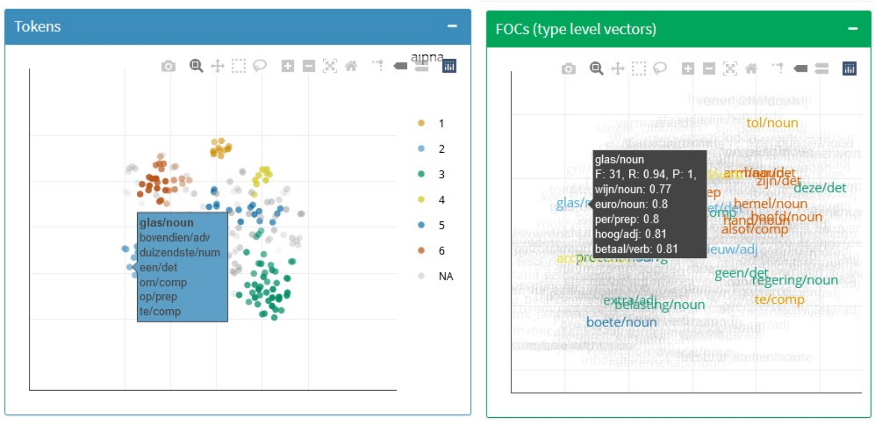
Figure 3.14: Top boxes of the t-SNE tab of the ShinyApp dashboard, with active tooltips.
The two bottom boxes of the tab show, respectively, the concordance lines with highlighted context words and information on cluster and sense, and a scatterplot mapping each context word to its precision, recall and frequency in each cluster. The darker lines inside the plot are a guide towards the threshold: in this case, relevant context words need to have minimum precision or recall of 0.5, but if they were modified the lines would move accordingly. The colours indicate the cluster the context word represents, and the size its frequency in it, also reported in the tooltip. Unlike in the type-level plot above, here we can see whether context words co-occur with tokens from different clusters. Figure 3.15 shows the right-side box next to the top token-level box. When one of its dots is clicked, the context words co-occurring with that context word — regardless of their cluster — will be highlighted in the token-level plot, and the table of concordance lines will be filtered to the same selection of tokens.
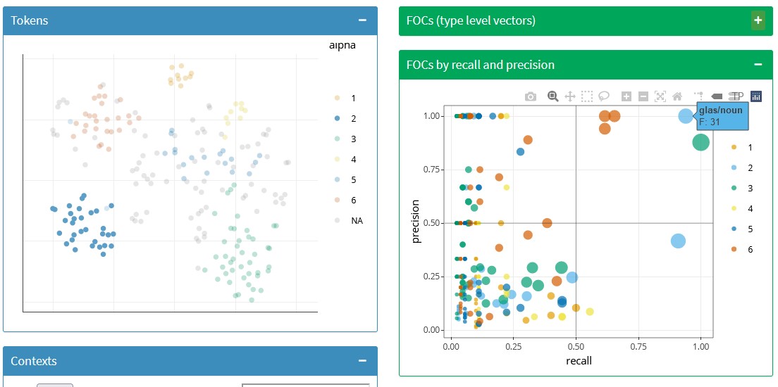
Figure 3.15: Token-level plot and bottom plot of context words in the t-SNE tab of the ShinyApp dashboard, with one context word selected.
The first tab of this dashboard is an extremely useful tool to explore the hdbscan clusters, their (mis)match with the t-sne representation and the role of the context words. In addition, the HDBSCAN structure tab provides information on the proportion of noise per medoid and the relationship between \(\varepsilon\) and sense distribution in each cluster. Finally, the Heatmap tab illustrates the type-level distances between the relevant context words, ordered and coloured by cluster, as shown in Figure 3.16. In some cases, it confirms the patterns found in the type-level plot; in others, like this model, it shows that most of the context words are extremely different from each other, forming no clear patterns. This is a typical result in 5000all models like the one shown here and tends to lead to bad token-level models as well.
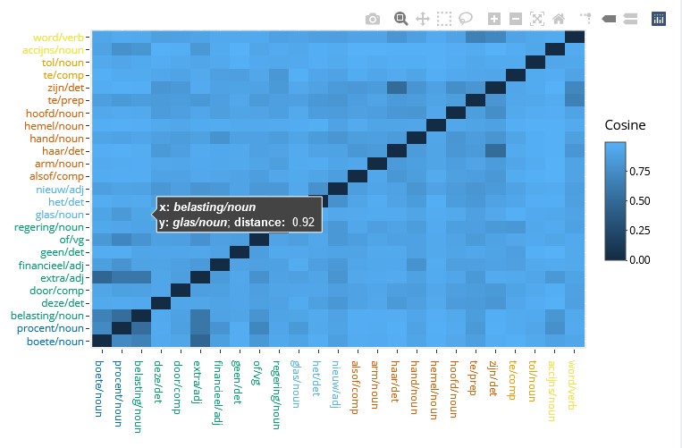
Figure 3.16: Heatmap of type-level distances between relevant context words in the ShinyApp dashboard.
3.6 Summary
In this chapter two visualization tools for the exploration of token-level distributional models have been described. Both are open-source, web-based and interactive. They were developed within the Nephological Semantics projects at KU Leuven and constitute the backbone of the research described in this dissertation.
Data visualization can be beautiful and contribute to successful communication, but its main goal is to provide insight (Card, Mackinlay & Shneiderman 1999). Indeed, these tools have provided a valuable interface to an otherwise inscrutable mass of data. NephoVis offers an informative path from the organization of models to the organization of tokens, representing abstract differences generated by complicated algorithms as intuitive distances between points on a screen. Selecting different kinds of models and moving back and forth between different levels of granularity is just a click away and incorporates various sources of information simultaneously: find all models with window size of 5, look at them side by side, zoom in on the prettiest one, read a token, read the token next to it, find out its sense annotation, go back to the selection of models… Abstract corpus-based similarities between instances of a word, and between ways of representing these similarities (i.e. the models) become tangible, colourful clouds on a screen. Most of the points discussed in the second part of this dissertation would have been simply impossible if it were not for these tools. Hopefully, they will prove at least half as valuable in future research projects.